Your Price Sensitivity Data Might Be Wrong
Every pricing dashboard has a favorite number. For most sellers it's conversion rate at the current price point. Check it daily. Watch it move. Feel something about the movement. It's also the number least likely to tell you anything you don't already know.
A Checkout Test That Was Wrong While Being Correct
Here's a test that ran on a checkout flow, not a price, but the math is identical. Two weeks, two variants, seven thousand visitors each. Combined results said Control won: 4.14% conversion against Variation's 3.36%. Clear enough to ship.
Except it was wrong. Split the same data by new versus returning visitors and Variation won in both groups.
| Segment | Control | Variation |
|---|---|---|
| Combined (aggregate) | 4.14% | 3.36% |
| New visitors | 2.0% | 2.5% |
| Returning visitors | 5.0% | 5.5% |
Not close in either segment. What happened is that returning visitors, who convert at a higher baseline no matter what they see, got funneled disproportionately into Control mid-test. The aggregate number wasn't lying exactly. It was answering a question nobody meant to ask: which version performs better on this particular traffic mix, not which version performs better.
Statisticians have a name for this. Simpson's paradox: a trend that appears in several different groups of data reverses or disappears when the groups are combined. It shows up in medicine, in baseball batting averages, in college admissions data. It also shows up, constantly and invisibly, in pricing tests.
The Pricing Version of the Same Mistake
Run an elasticity test on a product and blend the results across your whole customer base, and you've made the checkout-flow mistake with a different label. Loyal repeat buyers are close to price-insensitive. They've bought before, they trust the brand, a five percent move barely registers. Cold traffic from a paid ad is the opposite. They're comparing you to three other tabs and the price is doing most of the persuading. Blend those two groups into one elasticity curve and you get a number that's too soft to be useful for the paid-traffic buyer and too aggressive to be necessary for the loyal one. The model isn't broken. It's just been asked to describe two different markets as if they were one.
This is the part that's easy to miss, because the instinct when a pricing test comes back flat or ambiguous is to collect more data. Run it longer. Add another variant. More rows in the spreadsheet feels like progress. But more data run through the same blend just produces a more confident version of the same wrong number.
The actual gap usually isn't volume. It's selection: which segments get pooled together before anyone looks at the elasticity read, and whether that pooling was a deliberate choice or just how the export came out of the tool.
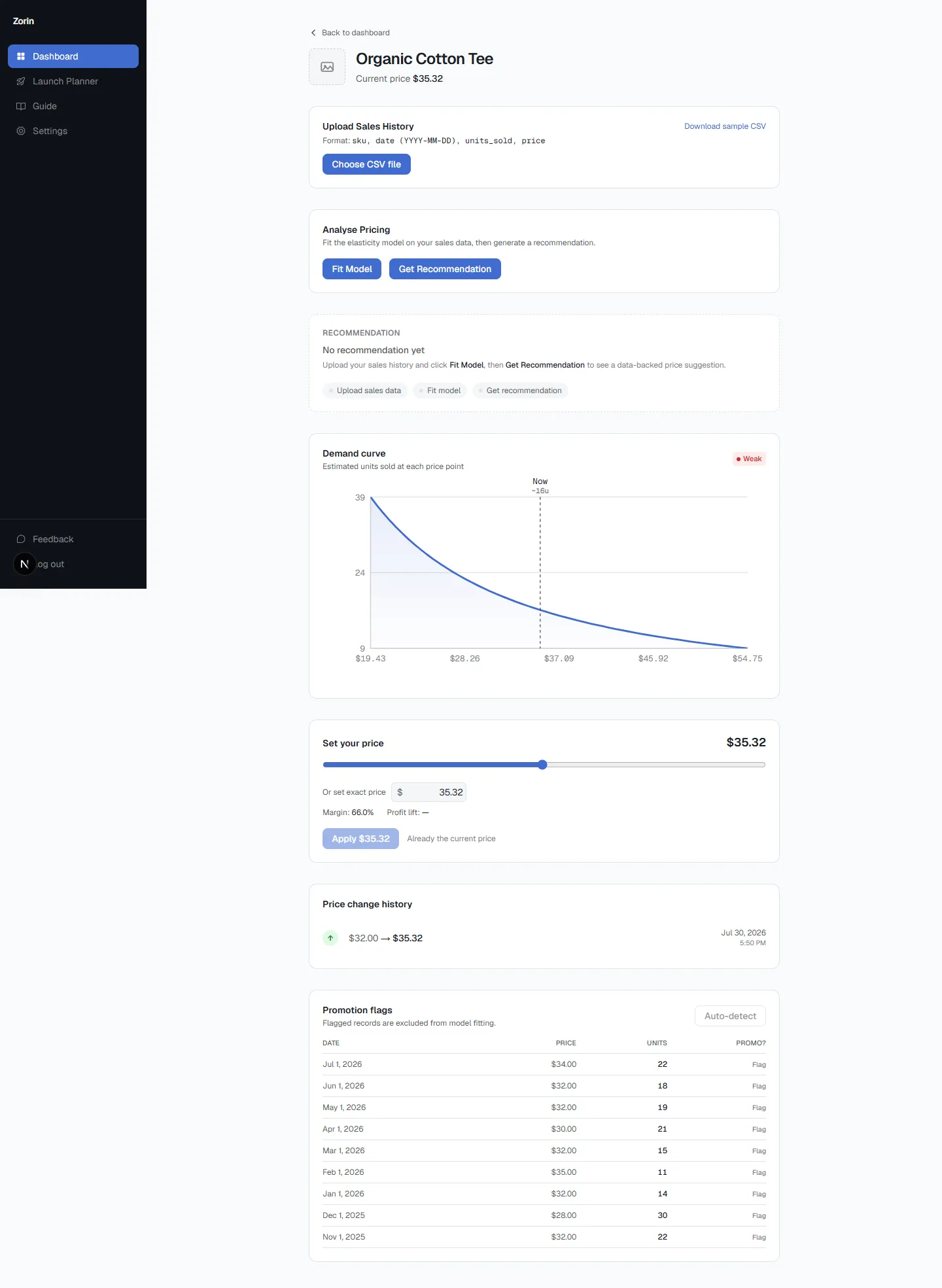
See what Zorin's elasticity model says about your own catalog.
Start free trialData-Poor Is Not the Same Problem as Data-Misaligned
There's a broader pattern here that shows up well outside pricing. Tom Berger, who advises early-stage B2B companies on go-to-market strategy at bergerCMO.ai, has written about the difference between being data-poor and being data-misaligned among startup teams: most of them aren't short on data. Their dashboards are full. The problem is that the metrics on the dashboard got selected, often without anyone deciding to do it on purpose, to confirm what the team already believed. The number that would actually change the strategy is sitting in a segment nobody split out.
Swap "startup team" for "ecommerce seller" and the mechanism doesn't change at all. A blended elasticity number that confirms the price you already picked isn't evidence. It's a mirror.
What to Check Before You Trust the Next Test
Before a pricing test changes anything, split it by acquisition channel and by new-versus-repeat at minimum. If the two segments move in different directions, or by meaningfully different amounts, the blended number was never going to be actionable in the first place. And if you can't split it, that's worth knowing too. It means the current setup can only ever hand you an average, and an average is a specific kind of answer to a specific kind of question that isn't "what should this product cost."
The elasticity number wasn't wrong. It just answered a question you didn't mean to ask.
Key Takeaways
- A blended A/B test result can reverse completely once split by segment, this is Simpson's paradox, and it shows up in pricing tests as often as in checkout-flow tests.
- Blending loyal repeat buyers with cold paid-traffic visitors into one elasticity curve produces a number too soft for one group and too aggressive for the other.
- The instinct to collect more data when a test looks flat usually makes the problem worse. More volume through the same bad blend just produces a more confident wrong number.
- Split by acquisition channel and by new-versus-repeat before trusting a pricing test. If you can't split it, the result is an average, not an answer.
- A dashboard that only ever confirms the price you already picked isn't evidence, it's a mirror. The number that would change your strategy is usually sitting in a segment nobody split out.
Frequently Asked Questions
What is Simpson's paradox in pricing tests?
It's when a trend visible in each individual segment of your data reverses or disappears once the segments are combined into one aggregate number. A price test can show one price winning overall while the opposite price actually wins in every real customer segment, because the segments weren't evenly represented in the combined data.
Which segments should I split a pricing or elasticity test by?
Acquisition channel and new-versus-returning visitor status are the two minimum splits. Loyal repeat buyers and cold paid-traffic visitors typically have very different price sensitivity, and blending them produces a number that's wrong for both.
Why doesn't collecting more data fix a flat or ambiguous pricing test?
If the test is blending segments that should be separated, more volume just produces a more statistically confident version of the same wrong, averaged number. The fix is splitting the data correctly, not running the same blend longer.
What does it mean if I can't split my pricing data by segment?
It means your current setup can only ever hand you an average across your whole customer base, which answers a narrower question than "what should this product cost." It's worth knowing that limitation exists before trusting the number.
How is this different from just having too little data?
Being data-poor means not having enough volume to read anything reliably. Being data-misaligned means having plenty of data, but pooled in a way that hides the signal that would actually change the decision. Most pricing dashboards have the second problem, not the first.
How does Zorin avoid this blended-average problem?
Zorin fits a price elasticity model per SKU from a store's own historical price and quantity data, rather than a single blended conversion number across the whole catalog, with a confidence score reflecting how much real data and price variation actually support each product's estimate.
For the full worked math behind reading price sensitivity from real response data rather than a single blended average, Van Westendorp Calculation: A Worked Example walks through the calculation step by step. Curious what a segmented, per-SKU elasticity read looks like on your own catalog? See your first recommendation in Zorin.
So before you trust the next pricing test, name the segment that actually moved, and why. If that answer isn't sitting somewhere in the report already, the test measured the wrong thing, and no amount of additional traffic is going to fix that.
Written by Tom Berger
Tom Berger is a Portfolio CMO for B2B SaaS with 25+ years of experience building and leading marketing functions from Series A through growth stage, including VP Marketing roles at DigitalOcean, Bolt, and Sift. He writes about go-to-market strategy at bergerCMO.ai.