Van Westendorp Calculation: A Worked Example
A Van Westendorp price sensitivity meter turns four survey questions into four price points: PMC, PME, OPP, and IPP. Almost every guide on the method explains what those letters stand for and stops short of showing the actual math. This post doesn't. Below is a full worked example, ten survey responses, real cumulative percentages, and the exact intersection arithmetic that produces a final acceptable price range.
Meet the Example: One Product, Ten Survey Responses
Say you're a Shopify merchant launching a $50 canvas weekender bag and you have no idea if that price is right. You send a four-question Van Westendorp survey to ten past customers and prospects. Each person answers with a price for each of the four classic questions: too cheap, a bargain, starting to feel expensive, and too expensive.
| Respondent | Too Cheap | Bargain | Getting Expensive | Too Expensive |
|---|---|---|---|---|
| 1 | $15 | $25 | $35 | $50 |
| 2 | $40 | $50 | $60 | $90 |
| 3 | $20 | $30 | $45 | $60 |
| 4 | $30 | $40 | $55 | $75 |
| 5 | $18 | $28 | $42 | $58 |
| 6 | $35 | $45 | $58 | $82 |
| 7 | $22 | $33 | $48 | $65 |
| 8 | $28 | $38 | $52 | $70 |
| 9 | $32 | $42 | $56 | $78 |
| 10 | $25 | $36 | $50 | $68 |
Respondent 2 is a clear outlier, someone comfortable paying twice what everyone else considers reasonable. Real survey data almost always has at least one respondent like this, and the method is built to absorb it rather than requiring you to throw it out.
Step 1 to 3: From Raw Answers to Cumulative Percentages
The four answer columns don't get compared directly. Each one becomes a cumulative curve first, and the direction of that cumulation depends on which question it answers.
- Too cheap and bargain answers cumulate downward. For any price P, calculate the percentage of respondents whose answer to that question is P or higher. These start near 100% at low prices and fall as price rises, since fewer people think a high price is still "too cheap" or "a bargain."
- Getting-expensive and too-expensive answers cumulate upward. For any price P, calculate the percentage of respondents whose answer is P or lower. These start near 0% at low prices and climb as price rises, since more people agree a high price is "expensive" the higher it gets.
- Repeat this at every price point that shows up anywhere in the data. You don't need every dollar amount, just the values respondents actually gave.
Running that calculation across the ten responses above, at $5 checkpoints, produces this:
| Price | Too Cheap | Bargain | Getting Expensive | Too Expensive |
|---|---|---|---|---|
| $15 | 100% | 100% | 0% | 0% |
| $20 | 80% | 100% | 0% | 0% |
| $25 | 60% | 100% | 0% | 0% |
| $30 | 40% | 80% | 0% | 0% |
| $35 | 20% | 60% | 10% | 0% |
| $40 | 10% | 40% | 10% | 0% |
| $45 | 0% | 20% | 30% | 0% |
| $50 | 0% | 10% | 50% | 10% |
| $55 | 0% | 0% | 70% | 10% |
| $60 | 0% | 0% | 100% | 30% |
| $70 | 0% | 0% | 100% | 60% |
| $80 | 0% | 0% | 100% | 80% |
| $90 | 0% | 0% | 100% | 100% |
At $30, for example, 40% of respondents still consider that price "too cheap" (four of ten gave a too-cheap threshold of $30 or higher), while 0% consider it expensive yet. By $55, nobody thinks it's too cheap anymore, but 70% think it's getting expensive. The story of the whole survey is visible in this one table, you're just watching for where the descending lines cross the ascending ones.
Step 4: Reading the Intersections
Each of the four price points is defined by where two specific curves cross. Where the raw data jumps between two price points without landing exactly on the crossover, interpolate a straight line between the nearest two rows to find the precise price.
- PMC (Point of Marginal Cheapness): where "too cheap" crosses "getting expensive." Below this price, too many people doubt the product's quality. In this data, that happens between $35 (too cheap 20%, expensive 10%) and $40 (too cheap 10%, expensive 10%), interpolating to $36.
- PME (Point of Marginal Expensiveness): where "bargain" crosses "too expensive." Above this price, rejection accelerates. That happens right at $50, where bargain has fallen to 10% and too-expensive has just reached 10%.
- OPP (Optimal Price Point): where "too cheap" crosses "too expensive," the price where the fewest people object on either extreme. That lands between $40 and $45, interpolating to $42.
- IPP (Indifference Price Point): where "bargain" crosses "getting expensive," the psychological midpoint where equal numbers see the price as a deal or a stretch. That falls between $40 and $45, interpolating to $43.50.
Put together: an acceptable price range of $36 to $50, an optimal price point of $42, and an indifference point of $43.50. The original $50 launch price sits right at the edge of what this sample will tolerate, worth knowing before you commit to it, not after the first month of underwhelming sales.
See what Zorin's elasticity model says about your own catalog.
Start free trialWhy This Wobbles With Too Few Responses
Ten responses is enough to demonstrate the method, but it's a small sample, and small samples carry real statistical risk that a clean-looking table can hide. The standard margin of error for a proportion is roughly 1.96 × √(p(1-p)/n). At a 50% split with 10 responses, that's a margin of error of about ±31 percentage points. At 100 responses, the same split narrows to about ±10 points. A curve built on 10 responses isn't wrong, but it's far less stable than it looks, and a single unusual respondent, like Respondent 2 in the table above, can shift an intersection more than you'd expect.
This is also why running the survey correctly matters as much as calculating it correctly. Most practitioners treat 100 or more responses as the practical floor before treating results as defensible, with 150 to 200 preferred if you plan to segment by customer type or plan tier. Below roughly 100, the intersections become unstable enough that a second batch of responses can move them meaningfully, which is exactly why Zorin's own survey feature labels anything under 20 responses as low confidence rather than presenting it with false precision.
Manual Math vs. Automated Tools: When Each Makes Sense
Working through the calculation by hand once, the way this post just did, is genuinely useful. It removes the mystery from a number a tool hands you and makes it easier to sanity-check an output that looks off. But doing it by hand every time you want to test a new product doesn't scale, and it's easy to make a small transcription error across dozens of respondents and hundreds of data points that quietly shifts an intersection without anyone noticing.
| Approach | Best for | Real cost |
|---|---|---|
| Manual spreadsheet | Learning the method, auditing a suspicious result, a one-off small survey | Slow, and error-prone once respondent counts climb past a few dozen |
| Automated tool (Zorin or similar) | Ongoing use across a catalog, larger response counts, cross-referencing against sales data | Requires trusting the tool's math, which is exactly what a manual walkthrough like this one lets you verify once |
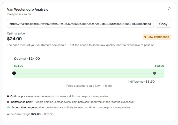
Zorin runs this exact calculation automatically. A merchant generates a shareable, no-login survey link per product, and responses feed straight into the same PMC, PME, OPP, and IPP math worked through above, without a spreadsheet, a pivot table, or a chance to mistype a cell reference. The survey stays a separate, stated-preference signal alongside Zorin's elasticity model, which reads what customers actually did with past price changes rather than what they say they'd pay, and the two are deliberately kept side by side rather than blended into one number.
Setting Your Price: What the Range Does and Doesn't Tell You
A $36 to $50 range doesn't hand you a single answer, it hands you boundaries. Where you land inside that range depends on factors the survey doesn't measure: your margin at each price point, how much inventory risk you're carrying, and whether you're optimizing for volume or per-unit profit on this specific launch. The optimal price point, $42 in this example, is a reasonable starting anchor precisely because it's where the fewest people object on either end, but it's a starting point, not a mandate.
It's also worth treating this as one input rather than the whole decision. Stated preference and revealed preference are different signals, and research on Van Westendorp results has found stated thresholds often run lower than what customers actually pay once a product is live. If you already have comparable sales history, cross-check the survey range against it. If you're launching something genuinely new, the survey is often the only signal you have until real sales data exists.
Key Takeaways
- PMC and PME cumulate the "too cheap" and "bargain" answers downward, while "getting expensive" and "too expensive" cumulate upward. All four intersections come from crossing a downward curve with an upward one.
- PMC (lower bound) and PME (upper bound) define your acceptable price range. OPP is where the fewest people object on either extreme. IPP is the psychological midpoint between "deal" and "stretch."
- Where two rows bracket the actual crossover, interpolate a straight line between them rather than rounding to the nearest observed price.
- Small samples carry a real, quantifiable margin of error, roughly ±31 points at n=10 versus ±10 points at n=100 for a 50% split. Treat results under 100 responses as directional, not final.
- Doing this calculation by hand once is worth it for understanding the method. Doing it every time for every product is where an automated tool like Zorin earns its keep.
Frequently Asked Questions
How do I calculate my Van Westendorp price points from survey responses?
Turn each of the four answer columns into a cumulative curve: "too cheap" and "bargain" cumulate downward (percentage answering that price or higher), "getting expensive" and "too expensive" cumulate upward (percentage answering that price or lower). PMC, PME, OPP, and IPP are the four points where a downward curve crosses an upward one.
How many survey responses do I need before my Van Westendorp results are reliable?
Most practitioners treat 100 responses as the practical floor, with 150 to 200 preferred for segmented analysis. Below that, the margin of error on any single price point is wide enough that a second batch of responses can move the intersections meaningfully.
Can I calculate a Van Westendorp price sensitivity meter manually in a spreadsheet?
Yes, for a small dataset. Build the four cumulative curves as columns, then find where "too cheap" crosses "getting expensive" (PMC), "bargain" crosses "too expensive" (PME), "too cheap" crosses "too expensive" (OPP), and "bargain" crosses "getting expensive" (IPP), interpolating between rows where needed.
What does a Van Westendorp price range actually look like in practice?
In this post's worked example of ten responses for a $50 product, the acceptable range came out to $36 to $50, with an optimal price point of $42 and an indifference point of $43.50, meaning the original $50 launch price sat right at the top edge of what the sample would tolerate.
What happens if I price outside the range my Van Westendorp survey identified?
Pricing below PMC risks the product being perceived as suspiciously cheap or low quality. Pricing above PME risks accelerating rejection on cost grounds. Neither is an automatic failure, but both mean you're pricing against what the surveyed group told you they'd accept.
Why do the cumulative percentages move in different directions for different questions?
Because "too cheap" and "bargain" answers represent a ceiling a respondent is comfortable with (so lower prices always qualify too, pulling the curve down as price rises), while "expensive" and "too expensive" answers represent a floor (so higher prices always qualify too, pushing the curve up as price rises).
Does Zorin calculate this automatically, or do I have to do the math myself?
Zorin calculates it automatically from your survey responses and shows the resulting range, optimal price point, and indifference point directly on the product, alongside a confidence tier based on response count. The manual method in this post is for understanding what's happening behind that number, not a requirement for using it.
If you're about to run this survey for the first time, grab the exact four-question wording from the free Van Westendorp survey template, and how to run a price sensitivity survey covers distributing it before any of this math applies. How to interpret Van Westendorp results covers what to do with the range once you have it. Ready to skip the spreadsheet entirely? Generate a survey link in Zorin and let the calculation run itself.
The math behind PMC, PME, OPP, and IPP isn't complicated, it's four cumulative curves and four intersections. What's easy to get wrong is treating a small sample's output as more precise than it is. Run the numbers by hand once to trust what a tool gives you, then let the tool handle it at the volume a real catalog actually needs.
Written by Dexter
Dexter is part of the team at Zorin, building tools that help ecommerce merchants price with data instead of guesswork.